TDN 3001 Blog Posts

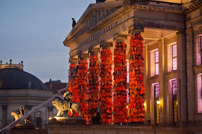
BROOK ANDREW: THE RIGHT TO OFFEND IS SACRED — Exhibition Review

Hidden upstairs in the Ian Potter Centre, at the back of the Federation Square is a beautiful yet solemn experiential reminder of the mistreatment of indigenous cultures that has happened since the beginning of time. Brooke Andrew is an artist who explores controversial topics of race, gender, history and violence, and explores these ideas with curiosity and respect. ‘The Right To Offend Is Sacred’ is a comment on the discrimination and oppression of not only Australian Indigenous people, but Indigenous people from all over the world. He approached the topic in quite a loud and confronting manner, utilising a variety of media within the exhibition, bright colours and bold imagery. The juxtaposition of the traditional nineteenth century etchings and lithographs, and the radiant neon tubes of primary colours in the front section of the exhibition is intriguing. It allows the audience to understand the contemporary issue that still exists regarding the oppression of people with coloured skin, and it also highlights the obscene, powerful and sometimes overwhelming nature of these actions.

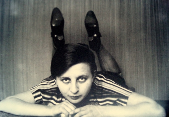
We can also look at how Andrew explores the idea of identity and spirituality within the exhibition, using many large photos of indigenous people in a large percentage of the works. The purpose being to make aware on these ideas of forgotten identities and subjugated religions and ideals, we are asked the question of ‘who are these people?’ and ‘what do they represent?’, as well as the question of whether the use of these photos is ethical and with permission from the subjects. The use of the black screen-print on a silver painted canvas gives the images their own unique quality which is Andrew’s appropriation in a sense. But it also begs the question of ‘cultural property’, both legally and ethically; these photos may have been taken over 70 years ago and so no longer hold copyright, however, does the use of this provoking photography defy traditional laws and customs of the people and cultures involved?[1]

SexyAndDangerous_BrookeAndrew

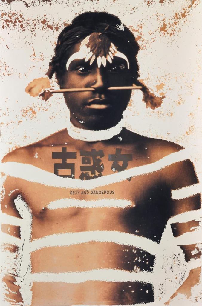
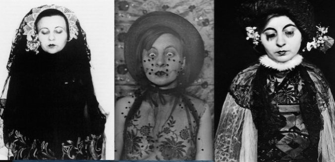
Brooke Andrew, Sexy and Dangerous, 1996.

One work in particular stood out to me as being a very strong, and clear abbreviation of the exhibition and Andrew’s approach to the oppression of indigenous people. “Sexy and Dangerous” 1996, is a large computer-generated colour transparency on transparent synthetic polymer resin. [2]  The artwork depicts a shirtless, Australian Aboriginal male with a culturally significant wooden rod pierced through his nose. The image is then overlayed with white brush strokes and Chinese characters. Beneath the characters reads “Sexy and Dangerous”. My initial thoughts were that it is not dissimilar to a magazine cover; blown-up model shot with inciting and provoking text over the top. Andrew subtly, yet strongly communicates his discern for the glorification of indigenous people in this artwork, and commenting on the power relationship between western society and indigenous people, by exploiting our cultured minds that are used to seeing images like this on magazines and television commercials. Yet in this situation our mind does a double take; was that image used with permission from the subject, do those characters relate to the subject at all and what does ‘sexy and dangerous’ imply?

Overall this work is very provoking and powerful in its message, highlighting matters of oppression, appropriation, identity and image.


[1] Myers, Fred. “Ontologies of the Image and Economies of Exchange.” American Ethnologist 31.1 (2004): 5-20. Web.

[2] Andrew, Brooke. Sexy and Dangerous, 1996, computer-generated colour transparency on transparent synthetic polymer resin, 145.9 × 96.0 cm, National Gallery of Victoria, Melbourne.


SHUJA HAIDER: THE SAFETY PIN AND THE SWASTIKA — Street Press Analysis (Zine)

In the early to mid 1970s the subculture known as ‘Punk’ emerged in several cities across the United States, the United Kingdom and Australia. The subculture was embodied by a broad range of visual and conceptual ideals, based primarily in punk-rock music, but branching out in to the realms of dance, visual art, literature, film and, most-notably fashion. The punk movement was about rebelling against modernism and ‘your parents’; most the punk movement’s population consisted of young people who wanted to set themselves apart from mainstream culture.[1]

safety-pin

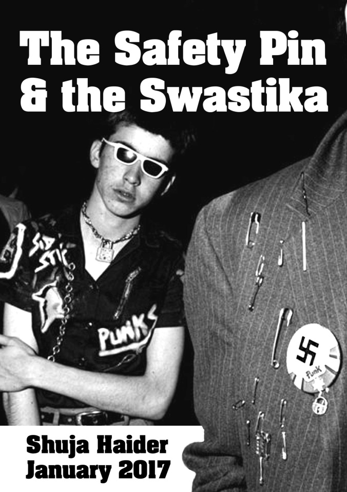
Shuja Haider, The Saftey Pin and The Swastika Zine Cover Image, 2017. 


The aligned with a very cut and paste aesthetic — grungy and makeshift; this was inspired by the music genre they listened to. This was then translated into fashion through the tearing of clothing items, studs, badges and safety pins. It was here that the safety pin became a symbol for the punk subculture, and was associated with punks “even more so than with seamstresses.”[2]

And as for the swastika, the punks thrived on being ‘hated’, and so embraced the swastika as a symbol to represent them. The use of this icon was controversial as it was used by Hitler as an identifying symbol with during the Second World War, and thus, the general British population knew the swastika as something that signified the ‘enemy’.

Forty years on the safety pin and the swastika are appearing in modern society, but for entirely different reasons. We can now see the safety pin used as a symbol in a much more literal sense. It began with an American expatriate living in London, who wanted to inform people that she was safe to be around after the violence of the Brexit riots; she didn’t want to fall into the category of ‘alien’ to the British population, like so many expatriates did during this time. And so, she adopted the safety pin as a sign to show people that “they were safe in her presence”.[3] This idea was spread on twitter and ‘#safetypin’ was trending for a while. This trend eventually grew even broader and was picked up by magazines and newspapers, creating fashion trends such as diamond encrusted safety pins and over $1000 safety pin earrings. From a simple idea, the safety pin symbol is appropriated to fit within a different ideology and context; shifting its meaning from something rebellious and harsh, to something friendly and positive.[4]

It is interesting that in relation to design, something so simple and practical has become a symbol for such a broad variety of different parties and ideologies. The simple twist a metal wire has situated itself on the clothing of punks, popstars, expats and seamstresses over less than 100 years.


[1] Gill, Alison. “Deconstruction Fashion: The Making of Unfinished, Decomposing and Re-assembled Clothes.” Fashion Theory: The Journal of Dress 2.1 (1998): 25-49. Print.

[2] Haider, Shuja. “The Safety Pin and The Swastika,” Subversion Press, January 2017, 1-12. Accessed April 3rd 2017: https://subversionpress.files.wordpress.com/2017/03/safety-pin.pdf

[3] Ibid.

[4] Myers, Fred. “Ontologies of the Image and Economies of Exchange.” American Ethnologist 31.1 (2004): 5-20. Web.

Forgotten Superheroes of Design: Gertrud Arndt

Gertrud Arndt2

‘Mask Portrait’ Gertrud Arndt

‘To be gendered is to be sexed’. [2]

One of the many first people to introduce or to experiment with ‘feminine identity’ was Gertrud Arndt. Born in 1903, Arndt a German weaver and photographer was a student of the design school, Bauhaus. In 1923, Arndt’s who had three years of  experience as an architect’s apprentice in Erfurt, Thuringia, was turned away from the architecture class in Dessau, Germany (Bauhaus) on account of her gender as architecture was dominated by men, and steered toward a weaving workshop, where the class was classified as a more ‘feminine’ design and women-friendly. Eventually graduating in 1927 and marrying Alfred Arndt, Arndt then resided in Dessau, Germany, and in that time was her focus shifted towards photography. Through her self-taught skills (and a seminal class taught by Laszlo Moholy-Nagy), Arndt started to photograph portraits of herself and friends each ‘masked’ with a range of costumes, props, background settings and hairstyles. [1]  In doing so, 43 self-portraits which she called ‘Mask Portraits’. While looking playful and inventive, the deeper understanding of Arndt’s works date back to the first time she was turned away as a women, where her experimentations formed the early conceptual idea that there was no such thing as a women, but instead only the representation women have formed society.

Gertrud Arndt

‘Mask Portrait’ Gertrud Arndt

However, her status as a photographer was forgotten, and overshadowed by the men in Bauhaus. Arndt’s role, was significant in developing the ideologies of feminism and defiance of society’s status quo. By using the signifiers of femininity for examples, flowers, delicate use of clothes and erotic allure, Arndt had created a visual of female myths.[3] Her props and styling also considered as a ‘mask’ and disguise, have helped challenge the conventions of a woman, using gendered objects to fabricate elements of social role-playing and sexual generalisation which was blurred by Arndt.[2]

Gertrud Arndt4

‘Mask Portrait’ Gertrud Arndt

In Pat Kirkham’s ‘The Gendered Object’, ‘Some of the longstanding arguments presented in feminist critiques (of many things, not just design) have focused on a patriarchal system which instill ‘traditional’ feminine values and positions women in an unequal relationship to men through stereotypical codes and images.’[2] Arndt, using familiar objects and materials associated with feminism and delicacy, aided our understanding of a standing role in society for women; where it reflects the prejudice Arndt and many other female designers experienced of that time. Trapped by these social conventions, it shows the wider social relations women had in their daily lives, and was used as a contradiction by Arndt in her ‘Mask Portraits’, where gender coding was a strong message. Arndt’s approach can be seen mocking the complexities and ignorance of the gender code and challenging the identity and representation of a women. However, her ideologies were not recognised by the design community or world until 1980. In 1932, the closing of Bauhaus had caused her family to move to Eastern Germany, during that time Arndt had effectively stop taking photographs entirely, eventually becoming a marginal photographer. However her work was an important stepping stone and inspiration for future female photographers Marta Astfalck-Vietz and Claude Cahun, where her work as a photographer quietly help our understanding of gender roles through photography.

Footnote:

[1] “Gertrud Arndt | Object:Photo | Moma”. Moma.org. N.p., 2017. Web. 7 Apr. 2017.

[2] Kirkham, Pat. The Gendered Object. 1st ed. Manchester, UK: Manchester University Press, 1996. Print.

[3] Morley, Madeleine. “The Many Disguises Of Bauhaus Photographer Gertrud Arndt”. AnOther. N.p., 2017. Web. 7 Apr. 2017.

Georgia Raynes-Greenow

Screen Shot 2017-04-05 at 6.39.32 pm.png

Vik Muniz’s exhibition, Metachrome, is being held at Ben Brown Fine Arts in Hong Kong. Muniz uses a wide range of unconventional materials to recreate artworks from all over the world. He gives these works another dimension that intrigues viewers by making them question how its made and forcing them to think beyond the instant recognition of such a masterpiece.

In this piece he uses sticks, crumbs and traces of pastels to recreate a famous art work by Piet Mondrian called Broadway Boogie-Woogie. By using pastels he is highlighting the use of bold colours in the original artwork. This brings a new light to the artwork by adding texture and making colour itself became the subject.

The reading, Ontologies of the image and economies of exchange, looked closely at appropriation

and how hard it is to draw the line on what is copying another artwork. It has caused many copyright issues in the past that look at the division between transformative works and derivative works. In Australia and in many cases, copyright laws are in place on all artworks until the artist has been deceased for 70 years or more. Although it has been 73 years since Piet Mondrian has died and therefore the copyright is no longer in effect, it makes you question about how easy it is for people to use other artists works in their design with only a small amount of manipulation and call it their own. In this instance, would people be as intrigued in this exhibition and in Vik Muniz’s work if the designs were his own? Does the instant recognition of a masterpiece draw in the attention? Is Muniz profiting from someone else creativity and hard work? Although in this instance Muniz has every right to reproduce this work it begs the question, where do you draw the line?

In 1999 Muniz created a manipulation of a piece by Andy Warhol called Double Mona Lisa. Muniz used peanut butter and Jelly to replicate the artwork. However the piece by Warhol was actually a manipulation of Da Vinci’s original master piece, Mona Lisa. Muniz created an appropriation of Warhol’s Double Mona Lisa which was an appropriation of Da Vinci’s original piece, Mona Lisa. Here you can see a line of artists profiting from a single artist and his work from many centuries ago. Muniz has used Warhol’s work even though it has not been 70 years since his death, however his work was already an appropriation of a previous work where the copyright had expired due to the death of its creator. Does this mean that Muniz has breached the copyright of Warhol’s artwork? Or is Warhol’s work not covered by the copyright laws because it is already an appropriation of a previous work?

There is such a fine line with copyright in todays society as everything is so accessible over the internet. You can find nearly any image or artwork you want just by typing the name into a search engine. This makes it very easy for anyone to take original artworks and adjust or manipulate them and then re-post them online as their own work.

Dreams-Cancelled-by-Banksy.jpg

Banksy is well known for his distinct style and politically charged artworks that include issues relating to greed, poverty and hypocrisy. In 2010 he created this artwork on the side of a building in Chinatown, Boston. As he is known all around the world he is using his platform to express his views on certain issues and he is able to be the voice for many others in the process.

Banksy’s aim was to get people to really question their freedom. The American dream looks at the ideals on which freedom includes the opportunity for success achieved through hard work in a society with few barriers. However over the past few years many have questioned the American dream and the reality of the time. Asking questions about their freedom and how few of these barriers there actually are.

Banksy really wanted people to consider their reality and the world around them. Is it what everyone makes it out to be? People were travelling from all over the world to visit the ‘land of opportunity’ however were severely disappointed to find it a lot more restrictive than they believed it would be.

When your young your told to follow your dreams however as you grow up you realise there are many barriers in the way before you can achieve your goal. Often people are unable to get over these barriers in order to achieve their dream. The world has changed and with each day more and more issues arise. The opportunity to follow ones dream decreases more and more everyday. This also makes people question whether the chance to follow our dreams was not so much cancelled but taken away from us.

Around the time Banksy created this piece, America was hit hard by political and economic issues. Many people were effected by these problems and in turn their dreams suffered.

The red ‘cancelled’ stencilled over the text resembles signs like ‘no smoking’ where people are once again restricted in their lifestyle. The colour symbolises power, almost rage and anger.

The man in the artwork is not happy with the changes he is having to make. However he is just doing his job. Obviously he is not living his dream and now he is cancelling other poeples. He is representing the public not living their dreams but instead going through the motions of their everyday life hoping one day they will get the opportunity.

Inkahoots is a collective group of artists who through the 1980’s and 1990’s produced exhibitions of posters that targeted political and cultural issues. Often very controversial they used their platform to bring up issues that were happening within society. They banded together with activists to promote issues throughout society in a hope that people would better understand and discontinue discriminating against fellow community members. Similarly to Inkahoots, Banksy wants to address the important issues and force people to ask the hard questions.

Sister Corita’s Summer of Love Exhibition Review

Sister Mary Corita, also known as Corita Kent (1918–1986), was an artist, educator, and advocate for social justice. At age 18 she entered the religious order Immaculate Heart of Mary, eventually teaching in and directing the art department at Immaculate Heart College. Kent was at the forefront of a movement by the Catholic Church in the 1960s to make the church more modern and relevant in modern society. Her art was one of the most successful methods of doing so, exhibiting a marriage of pop culture and contemporary issues with messages of faith and the power of God at a critical period of political unrest.

Kent’s work incorporates advertising images and slogans, popular song lyrics, biblical verses, and literature. Throughout the 1960s her work became increasingly political, urging viewers to consider poverty, racism, and injustice.[1] These political messages in her art reflects on the serious issues of the time, including the civil rights movement, the assassination of Robert F. Kennedy and the Vietnam War.[2]

One of Kent’s screen-printed pieces displayed in the exhibition Sister Corita’s Summer of Love is a powerful protest against the Vietnam War, titled “Stop the Bombing” 1967. The bold and powerful statement, “Stop the Bombing” is distorted and slanting, representative of the perverted nature of the Vietnam War. The poetic words that sit in the striking red block deliver a sense of helplessness. The handwritten-style words comment on the news, further advocating the unrelenting impact these issues have on the world. Kent conveys a message of hope for civil rights and an end to the Vietnam War.

Transcribed text:
Stop the Bombing
I am in Vietnam – who will console me?
I am terrified of bombs, of cold wet leaves and bamboo splinters in my feet, of a bullet cracking through the trees, across the world, killing me – there is a bullet in my brain, behind my eyes, so that all I see is pain
I am in Vietnam – who will console me?
from the six-o-clock news, from the headlines lurking on the street, between the angry love songs on the radio, from the frightened hawks and angry doves I meet a war I will not fight is killing me –
I am in Vietnam – who will console me?

Kent’s aim was to make her work as democratic as possible. “It’s why screen-printing was her medium of choice,” says Ray Smith director at the Corita Art Center. “She wanted her work to be low priced and accessible. It was everywhere.” [3] Kent’s philosophy directly correlates to that of the Australian community arts collective RedPlanet, advocating parallel issues to Kent, like the Vietnam War, through the screen-printed poster. The main goal driving both Kent and RedPlanet was a mode of creative and political expression that generated a direct and bold political message, rather than one of self-expression. Screen printing made it possible for both parties to explore the idea and belief that, as a matter of principle, it was everybody’s right to participate in the shaping of the world in which they lived.[4] The production of these highly charged political posters were created by two different organisations, in two different countries, across two different periods of time, both existing in and responding to relevant social and political issues, with the common conviction that art can be produced collectively to make political statements and influence social action.

Kent’s work reflects the dynamism and issues of the times in which she lived, while maintaining and communicating a sense of optimism and hope. Despite being made over 50 years ago her messages of resistance and opposing injustice remain incredibly relevant for the world today and continue to speak to contemporary audiences.

[1] “The Corita Art Center.” Corita Kent. http://corita.org/about-corita

[2] “Sister Corita’s Summer of Love.” Right Now. March 01, 2017. http://rightnow.org.au/review-3/sister-coritas-summer-love/

[3] “The Poster Art of Sister Mary Corita Kent.” KCET. June 15, 2015. https://www.kcet.org/shows/artbound/the-poster-art-of-sister-mary-corita-kent?utm_source=facebook&utm_medium=social&utm_campaign=artbound

[4] Tsara, Olga. “The Art of Revolution Political Posters in the RedPlanet Archive.” The La Trobe Journal, 2005, 94-112.

Punk, Pistols and Politics

The Punk movement is often viewed as a youth culture based on teen adolescence angst. However, Punk as a subculture goes much further than rebellion and fashion as punks generally seek an alternative lifestyle divergent from the norms of society.[1] The history of Punk subculture culminated from a tumultuous period of social, cultural, and political restructuring in the United States and Britain, including economic crisis and deindustrialization, the decline of movements for social change in the 1960s, and the growth of ultraconservative political forces.[2]

Punk represented a direct blow to the establishment, a statement against the political, social and artistic status quo. Its growth was fast, and its epicentres were London and New York, although it did appear in other areas. A crucial element of punk was the aesthetic. Punk artists were self-aware of the political, social and cultural statements they were making with their overall appearance and attitudes. If the 1960s saw a flourishing hippy community, with its anti-war world view, its emphasis on pacifism and free love, Punk adopted violence as the defining element. This violence was verbal, fiscal, conceptual and intellectual. Violence impregnated the music and the art produced by Punk bands. If the mainstream commercial music was played by talented musicians, often reaching levels of technical skill, Punk was designed to be the exact opposite: anyone could do it, and there was no need to achieve artistic excellence. In stark contrast to anything previously attempted in the music industry, Punk’s style was defined by “Do It Yourself”. If anyone could buy a guitar, anyone could form a band. If anyone could draw, anyone could be a designer. This became a naively manual culture, where lack of resources became a virtue, and lack of polished typography became a style itself.[3] Graphic design historian and scholar Steven Heller offered a succinct explanation of Punk’s style as “a raw expression of youth frustration manifested through shocking dress, music, and art. Punk’s naive graphic language – an aggressive rejection of rational typography that echoes Dada and Futurist work – influenced designers during the late 1970s who seriously tested the limits imposed by Modernist formalism”.[4]

In terms of aesthetics, Punk can be greatly attributed to designer Jamie Reid, author of the visual imagery of the Sex Pistols. Reid’s style, full of images, collages and in-your-face statements was provocative and rebellious, as he intended: “I saw Punk as part of an art movement that’s gone over the past hundred years, with roots in Russian agitprop, surrealism, Dada and Situationism.”[5] Reid’s repertoire included cut-out images, solarized photographs, photocopies, typographies stolen from newspapers, irregular, collage, disorganized, out of style, and all of this combined with bright, urban and provocative colours. Reid designed a promotional poster for the Sex Pistols album “Anarchy in the UK” in 1976. This distressed Union Jack flag image did not actually appear on the 7″ single sleeve, the single was originally issued in a plain black sleeve. The torn Union Jack flag is not only bold and direct, it is held together with safety pins, representing a clear intention of being disruptive and a message of rejection to the establishment. The borrowed letters from newspaper typography, reading “Sex Pistols” and “Anarchy in the UK”, is attached by Bulldog stationery clips strongly emphasising the do-it-yourself attitude. This was the first Sex Pistols design to use a Union Jack flag.

Punk is viewed as a movement that had the ability to capture a message that rejected the establishment, a passion for ugliness, a deviation from the mainstream and the do-it-yourself notion, a masterpiece disguised as a complete lack of artistry.

[1] Moran, Ian P. (2010) “Punk: The Do-It-Yourself Subculture,” Social Sciences Journal: Vol. 10: Iss. 1, Article 13. Available at: http://www.tezu.ernet.in/dmass/CBCT/Punk.pdf

[2] Moore, Ryan. (2004) “Postmodernism and Punk Subculture: Cultures of Authenticity and Deconstruction.” The Communication Review: 7, no. 3: 305-327. Available at: http://www.stevenlaurie.com/wp-content/uploads/2012/01/moore-punkauthenticity.pdf

[3] Medel, Ismael Lopez. (2014) “No hope, no future, no design. Punk Design, Jamie Reid and the Sex Pistols.” Creativity & Society, 1-27. Available at: http://www.creatividadysociedad.com/articulos/22/13_Lopez.pdf?.pdf?.pdf

[4] Heller, Steven. (1993) “Cult of the ugly” Eye Magazine, Vol. 3, Iss. 9. Available at: http://www.eyemagazine.com/feature/article/cult-of-the-ugly

[5] Guffey, Elizabeth E. (2006) Retro: The Culture of Revival. London: Reaktion Books Ltd. Page 141.

Visual Analysis 2.

Art and design, the two fields which are so close to each other but are so separated. There is a block, a line thats drawn between the two. Where one is focused on being aesthetic and to sell products and identities and the other to be free and to reflect the artists individuality there has grown a battle for people like me.

I have often been torn between the two, never knowing if one side is better suited for me and what I want to create. But after seeing a few designers/artists who have broken this barrier I have realised I don’t have to be restricted and defined by one field. The battle has come because of the format I use to make my work, even though I am not designing it or making it for anyone other than myself or my own expression, because it is made in a digital format which is often used for design I find it hard to call it art (personal work below).

The work doesn’t have to be opposite ends of the spectrum, but rather a hybrid of the two somewhere in the middle. It follows the ideas in the reading “What is Generative Art?” by Philip Galanter, he talks about this concept of generative art and how it refers mainly to the way in which the art is made. It is the use of a system or software that is autonomous, as Glatner defines it the art uses “autonomy contributing to or resulting in a completed work of art”.

When looking at a scale of generative art, there are two extreme sides surrounding the systems used. One being that they are totally random, they are scattered and out of control by the artist, and the other being they are typed and symmetrical. I sit in the centre of this. I have control over the randomness and symmetry in the work for what I see fit in the design.

ourCaste_Tyler-Spangler-YC-775px-04

Tyler Spangler

nickthomm_4

Nick Thomm


Nick Thomm and Tyler Spangler are artist/designers who embrace these ideas of generative art within their work. They can be seen as a hybrid of both fields, there works are individual and each unique but follow systems and programs to create aspects within the pieces. Where Nick Thomm utilises randomisation more in his work, Tyler Spangler’s prints are very repetitive and digitalised showing his use of symmetry and tiling. The two can be seen on each end of the generative art scale.


The difference between my work and the work of a strict designer or strict artist is the forms in which I use to make my pieces. Like Nick Thomm and Tyler Spangler my work doesn’t follow the traditional forms of specific design or art. It has hand made elements but also graphic software, and handmade generative art is all about “artists making intuitive design judgments from one moment to the next” and from this there is now a growing fusion between the worlds of art and design.

// Philip Galanter, “What Is Generative Art?”, Complexity Theory as a Context for Art Theory (n.d.).

// Elise Takehana, “Legitimising The Artist: Avant-Garde Utopianism And Relational Aesthetics”, Queens Journal of Visual & Material Culture, no. 2 (2009).

Visual Analysis 1

Social media, in all its platforms has grown and taken over within the last decade. Millennial’s have grown up with instant messages and uploads as a normal part of life.

They have learnt that to be “liked” or “followed” is a form of validation for themselves and it represents who they are. IHeart’s mural is a perfect representation of how our society has developed and become exactly this. His work is simple, a crying toddler upset at his lack of follows, comments or likes on the platform Instagram.originalParticularly in the western and developed world, the orange speech bubble with a heart, head or smaller bubble is all too familiar. It’s the sign of approval, the sign of someone liking your post and, thereby liking you, which is more than just a ‘want’ for people but rather a ‘need’.

But why does this resonate so much with us, most often a young child isn’t throwing a tantrum as illustrated by IHeart because of Instagram. Rather IHeart is commenting on how within us as a society, our internal distress can be so child like. Upset by the mundane, saddened by something which doesn’t physically exist. Instagram feeds our need for validation and when it isn’t there, or not fast enough or not by enough people, there can be a feeling of despair and upset. People have a need to feel cool or trendy, to be approved by as many people as possible.

As explained in “The Concept of Cool” it is said that “cool is about being in the know” It is about you keeping up with what society is following and their values at the current time, or about making sure that the rest of society see’s you as this ideal person. People are now making their lives out of Instagram, this media platform has been merged into our consumerist culture. Where the program was originally seen as an image sharing platform between friends, it has now taken over and become one of the leading marketing and advertisement platforms available.

People produce these fake images, pretend their lives are something they aren’t, something that they believe people want to see and believe, sell themselves and their life as a form of a product that is on trend. What they do everyone else soon wants to do. Instagram has grown to be about the “consumption of performance”. It is an act that can be bought, one that people will do anything to have in their possession even if the their reality falls short of the performance they have seen and idolised. It is because as Deighton puts it, “the symbolic products are used as props in performances enacted to influence others”. Instagram is there to distinguish what is cool. It sells to our needs for approval. It supports our vanity and our desire to appear better off than we really are.

// Frederic Jameson, “Postmodernism And Consumer Society”, The anti-aesthetic : essays on postmodern culture (1983): 111-125.

//Clive Nancarrow, Pamela Nancarrow and Julie Page, “An Analysis Of The Concept Of Cool”, Academic Papers 1,4 (2001).p313 -314

// “LOOK: Banksy – This Vancouver Artist”. The Huffington Post. Last modified 2017. Accessed April 5, 2017. http://www.huffingtonpost.ca/2014/03/05/banksy-vancouver-street-artist-iheart_n_4906494.html.

Exhibition review: Who’s Afraid of Colour

Art has always been one of the main ways to express feelings and emotions a person has and wants to share. This unique phenomenon appeared at the dawn of human civilisation and has been evolving along with our thought, trying to provide opportunities to express ideas topical to a certain period of time. For this reason, every epoch could be characterised by the new approach to art and a unique style explored by individuals. One of the main features of the modern age is the attempts to find new forms and ways to show a new vision of art as well as share unique ideas. Being satiated with traditional approaches, artists want to introduce something new to art and create a unique style.

Af100992           
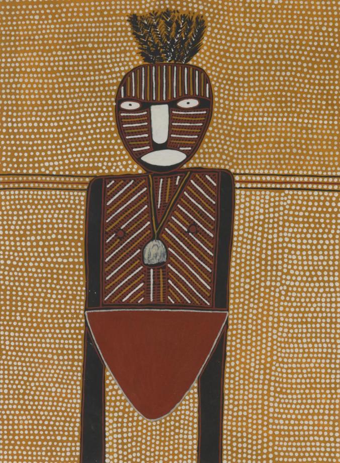
Purrukuparli, 2002 by Maryanne Mungatopi

It is also true of the exhibition Who is Afraid of Colour in Ian Potter Centre NGV, and Purrukuparli by Maryanne Mungtopi, which is one of the artworks presented there. The given picture presents a viewer with several unique features of the modern art. Besides, the usage of unusual techniques and colours helps to create a specific atmosphere and makes a person realize one of the main ideas of the contemporary painting which is the attempt to step aside from stereotypes, look for new forms, colours and accept the thought that the Western art should not hold a privileged position as there are many other unique cultures. Hence, the work Purrukuparli  is characterized by the usage of motifs peculiar to different unpopular cultures.

The given artwork could also be analysed using the theoretical framework suggested by investigators of the modern art. At the moment, the idea that we face the revolution in art becomes extremely topical[1]. The fact is that the concept of good or bad taste is considered outdated when the idea of good design prevails[2]. If to look at Purrukuparli from the classical perspective, it might seem awkward. However, it is designed to convey a specific idea and show an artist’s vision of the modern world. For this reason, the picture’s cultural value remains high as this artwork provides the information about the ideas peculiar to people who live in the coherent society.

As stated above, one of the main ideas of the given exhibit is to demonstrate the unique diversity of the modern world and great value of all cultures. That is why the colours peculiar to these regions are used in Purrukuparli. Moreover, when looking at this artwork, we could observe that motifs and techniques explored by bearers of other mentalities differ from the traditional ones. Enjoying this picture, a viewer becomes able to understand the nature of other civilisation and admire its beauty. For this reason, the usage of unusual colours and shapes when creating Purrukuparli could be considered the main approach used to attract attention to this very aspect of art and convey the main message.

To sum up, we could conclude that the modern art is a complex phenomenon that is used as the platform to express feelings, emotions and draw people’s attention to certain events. The exhibition Who is Afraid of Colour and picture Purrukuparli could also be analysed from this very perspective. The usage of mild colours and unusual curves contributes to the creation of the unique atmosphere needed for the improved understanding of the unique diversity peculiar to our planet.  It also helps us to look at art from another perspective and understand its multicultural character.


[1] Olga Tsara, “The Art of Revolution,” The La Trobe Journal 75, (2005): 10.

[2] Lisbeth Holm, ” Good Taste vs. Good Design: A Tug of War in the Light of Bling,” The Design Journal 15, no. 2(2012): 187.

Marginalised designers: Gorman 2016

7694062-3x2-700x467.jpg

(Left) Amber Ibareeche “Gemz” print compared to (right) Gorman “Geology” 2016 print.

Last year, the Melbourne-founded company Gorman, which has dozens of retail stores across Australia and New Zealand, was accused of copying the work of independent artists and designers. Gorman, a fashion brand which prides itself on kaleidoscopic ‘signature prints’ and distinctive colour palettes, denied the claim that they have utilised artist’s works in their designs.

New York artist Amber Ibarreche, associated with her well-known ‘Gemz’ print, declared that her artwork was appropriated for fabric used in Gorman’s Geology collection, which went on sale in 2016. Ibarreche, who sells the print featuring historical gem illustrations on her website, was forced to accept the similarity of designs as a coincidence when Gorman claimed they had used the same illustrations without prior knowledge of the artist’s print she made in 2010.

80acd20f8a1200866db42da3cd4e3395

Gorman “Terrazzo” 2016

Emily_Green_Lipstick_Pink_and_Periwinkle_Terrazzo_Drop_Earrings_Hi_Res_grande

Emily Green “Terrazzo” 2013

It was also revealed last year that Gorman’s new drop earrings for their Autumn collection named ‘Terrazzo’ were mistaken for a Melbourne jewellery designer’s own drop earrings. Emily Green, a well-recognised designer, had many customers mistake her jewellery that she had been selling since 2013, and also named ‘Terrazzo’, for the Gorman appropriation.

Again, Gorman denied referencing Green’s work and claimed that the word “terrazzo” is the name of the actual stone used to produce the earrings. Although Green was assured that the earrings were an imitation, she did not raise a formal claim with Gorman over the issue as she had previously been down a similar legal path and had received nothing.

Although the comparison of earrings makes it seem obvious that Gorman took inspiration directly from Green, the issue slips through the design appropriation loophole. Remaining a pressing issue in the contemporary design world, copyright, “famously, is known to involve a particular formulation of materiality, distinguishing idea from concrete expression, with only the latter being subject to ownership rights as a form of property.”[i] Unfortunately, we see a large number of artists today receiving little or no credit if their designs are emulated on an alternative platform as there is not yet a concrete regime set in place to protect the intellectual property of all works[ii]. It is difficult to distinguish a bright line between what is clear “ripping off” artwork or when another designer has just created a similar work by chance. It is a debate between artists and the law that has been open for some time and will continue to be an unrelenting issue for many – and it’s the impossibility that all artist’s will be protected of their design identity and autonomy.


[i] Myers, Fred “Ontologies of the Image and Economies of Exchange” American Ethnologist, Vol. 31, No. 1 (Feb., 2004), pp. 5-20

[ii] Weatherall, Kimberlee “Culture, Autonomy and Djulibinyamurr: Individual and Community in the Construction of Rights to Traditional Designs” The Modern Law Review, Vol.64, No.2 (Mar.,2001), pp.215-242


Street Press: 14,000 Lifejackets

lifejackets

Ai Weiwei, Chinese contemporary artist and activist, is known to convey a powerful communicative link to the public through his work on social and political issues. As a political activist, he has been highly and openly critical of the Chinese Government’s stance on democracy and human rights. Following a controversial arrest and imprisonment in China without any official charges being filed, Ai has become a widely broadcasted figure in the world of conceptual art.

In early 2016, Ai produced a five-column installation on the façade of Berlin’s Konzerthaus (Berlin’s largest concert and arts hall). A collection of around 14,000 discarded life vests were taken from the Greek Island of Lesbos after refugees had battled the Mediterranean Sea coming from Turkey. The installation was staged in coordination with the Cinema for Peace gala held at the Konzerthaus in an attempt to draw attention to the hundreds of refugees that try to reach Europe each day and how many had died since the beginning of that year. The critical response to Europe’s refugee crisis and the striking colour of the life vests radiate out from the Konzerthaus onto the street – compelling the interest of the general public; whether they’re rushing to work during the week or enjoying a Saturday night out. Strategically framing one of Berlin’s great attractions and constantly bustling venue – Ai broadcasts to Berlin and its tourists, his stance on the current social climate.

AiWeiweiKonzerthaus_05.jpg

It took one month to collect the lifejackets and complete the installation.

In “Overwriting Hate: The Queer Writing on the Bathroom Wall” by Mark Addison Smith, the author claims that “In the world of graffiti, writing over another’s work is considered the ultimate form of disrespect…In the world of protest, overwriting is a strategy as old as writing itself…Once we, as a community, learned to write (to voice), we also learned to overwrite (to edit, to alter, to censor, to shout, to reclaim).”[i] Ai chose to overwrite a significant and historical landmark of Berlin in order to reclaim a loud voice that advocates for the acceptance of refugees. The design in itself holds such power, both artistically and sociologically, that it forms an operating mode of “mass unification”[ii] as the public sphere acknowledges its message and influence.  Smith also discusses semiotics and the use of the metasymbol. A metasymbol, which is a symbol – like the peace dove or the swastika – whose contemporary meaning has changed across time due to cultural influence.[iii] Ai’s addition of lifejackets on the columns of the Konzerthaus in Berlin serves as a metasymbol reflecting the refugee crisis. Without any prior knowledge of the installation, one can instantly understand and be emotionally impacted by the objective of Ai’s work as we link the lifejacket to its current meaning. The lifejacket now has the contemporary association with individuals seeking asylum. What are some examples of symbols that have absorbed new meaning to become metasymbols? How have metasymbols been used to appeal to the community in a cultural or political climate?


[i] Mark Addison Smith, “Diversity and Design, Overwriting Hate: The Queer Writing on the Bathroom Wall” Routledge London,  pp 153-169, accessed April 3, 2017

[ii] Smith, Mark Addison.

[iii] Smith, Mark Addison.