Dazed – Declare Independance

EPSON088.jpg

Dazed magazine is British Fashion publication documenting arts and culture directed mainly at a youthful audience but not exclusive of other age brackets. In The editors letter of the Spring 2017 explores a range of issues effecting minority groups of America post Trump election, but looks to celebrate the subcultural movements that have been created out of reaction to a global crisis in order to band together and form an active revolution. I also found it interesting that in this current political climate, a resurgence of both punk values and aesthetic has been adopted by designers, brands, artists and musicians. This latest issue of Dazed pays homage to the chaotic of visual language as individuals form their own resistant movements. A nostalgic, black and white ad for Dior on the inside cover features Icon Boy George, in a suit adorned with a clutter of buttons on his lapels and across his oversized hat. It reminds me of a photograph I’ve seen by British sub culture photographer Derrek Ridges.

EPSON086.jpg

On another spread, a band of New York young guns are jiving through a dirty street. Captured on a black and white film, the young kids are styled with a nod to the nostalgia of DIY. Studs, denim, layering, button badges and tee shirt graphics that don’t sit central. The characters themselves are all young creative working in street culture. Photographers, stylists and designers all creating a shift in the industry with new ideas and new aesthetics. The images chaotic ’in relationship to the development of a graphic language of resistance [1] and similar to like the layouts of Punk fanzines. The magazine design itself clean and organized.

EPSON090.jpg

EPSON089.jpg

Another feature captures portrait shots of activists that are not only styled in a punk fashion, but also capture the essence of resistance in their practice. An emphasis on the working class ‘ credibility’ and a belief in various hues of class politics. [2] In particular the blurring of the lines of masculine and feminine and the move to de-sexualize the subject is also extremely punk.

EPSON087.jpg

An advertisement for Fashion brad MSGM features a protagonist who remarkably resembles Lead singer of The Sex Pistols, Sid Vicious. With his short spikey hair, donning an argyle knitted jumper, white pants with oversized keying’s through the belt loop. He steps forward towards the camera in his dirty ripped shoes, swinging a baseball bat.

It only makes sense that a resurgence of punk aesthetic and attitude is coming to front given the current political climate of the world and a general feeling of disconnect between youth and government. Punk is raw, aggressive, jarring and demands attention.


[1] Teal Triggs, Scissors and Glue: Punk Fanzines and the Creation of a DIY Aesthetic. Page 2

[2] IBID

Branding and the Maker Movement

Last year I had the amazing opportunity to be an intern as a graphic designer at a humble Private Label creative agency working in branding, brand strategy and packaging design. This experience sparked in me an interest in how brands can come to life through visual concepts and working together to truly communicate the nature of a product. I came to the conclusion that I have to always think critically about how a product is perceived as well as what I will do when I myself develop as a design professional.

This prompted me to do some research about some people in the design agency who work as the minds behind the bigger brands that we interact from day to day, yet never hear much about. One that caught my attention was a man named Gush Mundae.

Mundae was once a graphic design student who then went on to become the founder of Bulletproof Creative Agency. What differs their approach to marketing and design is the disciplines they use to eventually give the best face forward to the end-user. Bulletproof Creative Agency are known for using the latest ‘buzzword’ skills in the industry, using ‘shopper marketing skills’ in combination with great design ability and branding and packaging allow them the opportunity to work with clients such as GSK, Coca-Cola, Schweppes, Kenco, Heineken, Bacardi, Strongbow and Cadbury[1]. This sort of Participatory design[2] is what I aspire to waork with in the future and I am inspired by Mundae’s mindset in working together with clients and not for clients to create a product from conception.

41520_Cadbury-Marvellous-NPD-resized.jpg

An example of the work he has created in with Bulletproof is the challenge of creating the brand platform for “Cadbury Marvellous Creations” which could work globally across several different categories. A brief such as this is complicated as there is a tension formed by the need to disrupt the category conventions of chocolate while still maintaining the Cadbury brand values. This campaign can be considered a success as they played a part in helping Cadbury Marvellous creations become a £49.7M power brand in the UK alone within its first year. [3]

Parallel movements to this modern day age of consistently evolving brands and innovations is the Maker Movement.[4] During my experience working as an intern creating private-label brands or “Phantom Brands”, I was able to observe the process by which technology is used at first to conceptualise a project, working together with a client to reach the end product vision, and then analyse the vision on the end-user perspective based on consumer behaviour. Similarly to the maker movement, we worked to create 3D images which would be translated into real products. Furthermore, there was an element of remix and shared collaboration with other designers outside of the agency, and there was a consistent use of end-user feedback to create the final product.


[1] Source: http://www.wearebulletproof.com/

[2] Matthew Holt (2015) Transformation of the Aesthetic: Art as Participatory

Design, Design and Culture, 7:2, 143-165, DOI: 10.1080/17547075.2015.1051781

[3] Source: https://www.conveniencestore.co.uk/products/cadbury-conjures-up-three-new-marvellous-products-for-spring/355670.article

[4] Mark Richardson, Susie Elliott and Brad Haylock,(2013) “This home is a factory: Implications of the Maker movement on urban environments”. Vol 5, Craft + Design Enquiry


Political Street Art – Donald Trump

The predicament I find myself in writing in critique of the Design Tactics used within a political poster is that the veil of which my regular façade of indifference towards social and political issues is removed. I feel that it is important to outline this as somewhat of a disclaimer towards the content in which I am covering today in my post about persuasion through designerly means in relation to the American presidential election in 2016.

It is interesting to see the rise of Donald Trump in the American presidential election in regards to how the perception of him has evolved within the public in times of the presidential campaign. From my observation, the construction of publics through design has taken no other more aggressive means than when the topic of the American presidential election is at hand. Carl Di Salvo in his writing “Design and The Construction of Publics”[1] placed in reference to the philosophical ideas from the text “The Public and its Problems” by John Dewey[2] – Di Salvo gives interesting examples as to how we can analyse through design theory the ways in which the products and processes of design intersect with the public and how the question “How are publics made with things?” can be addressed as design becomes more and more politicised and used for political ends. In terms of design tactics, Projection and Tracing were two tactics outlined by Di Salvo that caught my attention which can be also used to analyse the political agenda outlined in the street art image below.

Screen Shot 2017-04-08 at 8.32.06 PM.png

Image:  off Pegasus’ Twitter account

This piece by Pegasus which likens Trump to Hitler led the street artist to receive death threats from the public is an example of projection in the way that it directly specifies a predictive scenario – And tracing as it tries to illustrate the scenario visually through means which some elements resemble Russian constructivist propaganda.

“Those who do not remember the past are condemned to repeat it.” If projection by definition of Di Salvo, is to use facts to present a predictive future – then this sort of image is one that does not display facts but merely represents trump as a figure which would prompt the audience to feel strong emotions of fear in association with a dictator leadership such as Hitler. The reasoning for the creation of this image is as a juxtaposition to the opponent in the presidential election, Hillary Clinton – and from the unfolding of the increasingly scandalous events leading to the election, it seems that the press and design of the image work together to try to paint the worst picture of each of the candidates as possible – denying facts but rather working on fear mongering in order persuade one group for a political movement. Tracing in this scenario, is used to illustrate Trump as one with his mouth blaringly wide open giving out as a tyrant, but this image is a farce and an extreme exaggeration of the current situation at hand. This sort of storytelling is dangerous in that it only portrays one’s view of Trump in a way that does not represent any fact but rather a hyperbole to incite fear of what is to come.

[1] – John Dewey, The Public and Its Problems (Athens, OH: Swallow Press Books, Henry Holt & Company, 1927).

[2] Carl Di Salvo, Design and the Construction of Publics (2009 Massachusetts Institute of Technology, Design Issues: Volume 25, Number 1 Winter 2009)


Street Press Image – Analysis – Gold on President Trump building

goldtrump


Gold, a somewhat controversial material in the realm of design and art, is the selected material of choice for some decorative elements to president trumps buildings. An article from Bloomberg highlights the mixed opinions of the inclusion of gold within the building from a series of interior designers. “Gold connotes richness, but also a sense of warmth and soul,” says Jamie Drake, known for his dramatic use of colours. Other designers believed that “overuse becomes gaudy” responding to the consistent use of golf throughout the building.

In like manner, designer John Saladino, believes “gold is meant to be a small glimmer, the delicate accent to the overall design.” It can be established that although there are many different perceptions on the effective use of gold in architecture or design, it is evident that gold evokes a sense of wealth and gaud. This notion of colour representing identity is so often overlooked as we view objects or identities from a consumer’s point of view. Colour has a benevolent power that can take design or art in any direction and target many different socieo-economic statuses.

It is interesting to see the contrasts between the different views of the interior architects that worked on president Trump’s building, highlighting the potency that gold can have on an identity.

In terms of visual appeal, the gold aesthetic evokes a real sense of wealth and power, formed over centuries from Egyptian ornaments to Roman armour. This understanding of gold as a sign of wealth is understood by many cultures around the work, however can be viewed differently by other cultures. China in this sense, use gold heavily throughout architecture and advertising as it is the colour of the emperors, a sign of good luck.

Furthermore, this notion of gold as a sign or code of wealth relates well to the case study of aboriginal artist and land rights activist Wandjuk Marika. Marika, known for his elaborate pattern work and sacred dot paintings, evokes a real sense of connection to the land with his work. Through the primary usage of earthy colours and tones paired with patterns, it is clear to see the powerful messages put forth by Marika in relation to the land. This has a similar clarity in its message to the golden accents of Trump’s building, in the sense that the message is easily recognised by most cultures and religions, just like the smile.

[1] Timothy L. O’Brien, 2016, “Donald Trump Loves Gold” (Posted online https://www.bloomberg.com/view/articles/2016-07-22/donald-trump-loves-gold-and-don-t-you-forget-in.)

[2] Fred Myers, Ontologies of the image and Economies of Exchange, (American Ethnologist, Vol. 43, No. 1, February 2004, pp. 5-20)


“Who’s afraid of Colour” – Ian Potter Centre NGV

ianpotter


Brought together by a range of female indigenous artists, “who’s afraid of colour” explores the notion of colour within an identity. Consisting of various works, including woven, digital and synthetic materials the exhibition combines organic works of art and juxtaposes them unexpectedly. Many of the paintings and photographs depict the artist’s views of the disadvantages of indigenous folk in society, as well as instances of racism. Such an eclectic mix of work poses a risk to the exhibitions visual coherency, however the central messages of the works maintain the same values of the indigenous story telling and identity.

This can be likened to Fred Myers’ “Ontologies of the image” in the sense that his central ideas of indigenous principals correlate with the exhibition. Myer’s explores the case study of Wandjuk Marika, who’s sacred artwork was stolen to be used on a commercial tea towel. Marika, thoroughly distraught over the scandal, questioned whether the individual who used his artwork understood the meaning behind it, perhaps overlooking the artworks message by focusing purely on the aesthetic quality. Like the exhibition, it is important to look further than a set of patterns or colours and place them in context to understand the artists true identity.

One cannot understand the social and political significance that a piece of artwork has on its artist via pure aesthetics, they must look further than meets the eye to see the real connection. It is very easy these values in artwork, especially when different cultures and religions are involved, as objectification can be often be the main protagonist when observing sacred artwork.

[1] Fred Myers, Ontologies of the image and Economies of Exchange, (American Ethnologist, Vol. 43, No. 1, February 2004, pp. 5-20)

[2] Judith Ryan, Who’s afraid of colour, December 2016, Posted online (http://www.ngv.vic.gov.au/essay/whos-afraid-of-colour/).

But can I get it on a tea towel? The transition of street art from a subculture to pop culture.

_73077420_17l6b55m

“The Kissing Coppers”, 2004, Banksy

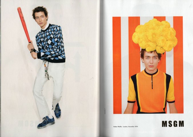
It is 2017 and much like many of our peers, street art has gone through its own version of the old coming-of-age identity crisis; an eat pray love moment that may or may not have involved spending far too much money in Katmandu, for a glamping trip to a first world country. Street art has taken itself on a journey from its rebellious, self-expressive and disenfranchised beginnings and turned into someone who gets excited over buying a new vacuum cleaner and always insists on buying over-priced gift shop tea towels.

This change has come about quietly and slyly, but street art has lost part of its shock factor. The rebellious medium, that was once used to drive artists’ agendas has essentially transitioned the scene from the sub-cultural to the pop-cultural.

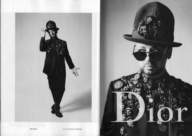
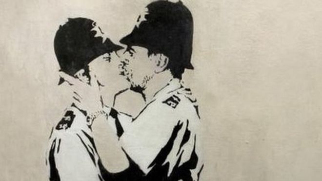
The values placed on street art have culturally shifted into a much more commercial platform. The most famous example of this is what society has chosen to do with Banksy’s art and it is interesting to see its fate aligns with many postmodernist theories. Banksy’s work became famous for his rebel personality and his witty critic of the government and political methods. However, with his new-found success, his work has now embraced a much more material culture, mostly on an aesthetic level of decoration.[1] There is no longer such a strong focus placed on the value of his product, but more what it gives when it is consumed. Banksy’ art has lost its true meaning by having it filtered down through various platforms of consumerism. For example, take his piece “Kissing Coppers”, spray-painted onto the side of the Prince Albert pub in Trafalgar Street near Brighton city centre in 2004, it became one of Banksy’s most famous street works. For years, it has been the two-fingered salute to the conventional art world, a poke in the eye for homophobes. But now, years after its creation, replicas of the piece can be found on a range of novelty pieces. Now only a trinket of consumerism. The fact that this once powerful imagery can be found on the likes of an overpriced tea-towel, has caused a power shift, demeaning the original imagery of its message.

It has become more commercially viable for street artists to move the art into a more commercial field, with Banksy’ success inspiring this change. The introduction of postmodernism’s ideas to street art, such as prioritising the consumption of images over their production has a lot to answer for.  There is no longer such a strong focus placed on the value of a product but more what it gives when it is consumed; how much revenue it can bring in.[2]

The rise of pop culture and the blurring of the lines between low commercial culture and fine art explores the concept of taste from a new perspective. Postmodernism allows for, ‘different kinds of cultural manifestations to be valued equally'[3] and at the same time has stripped down many hard-hitting, revolutionary artists work, to be on the same platform as meaningless copies on trinkets, created as part of our conveyor-belt society.


[1] Sparke, Penny. (2004) An introduction to design and culture: 1900 to the present, 2nd Ed, London, ch.9 Postmodernism and Design, pp.189-197

[2] ibid.

[3] ibid.

Sista Cortia was one boss ass bitch.

9.newsoftheweek_corita

Sista Corita Kent was a Roman Catholic nun, who lived, studied and taught at the Immaculate Heart of Mary in Los Angeles. Kent’s work was encouraged by Vatican II (1962), a movement that aimed to modernise the Catholic Church and make it more relevant to contemporary society.

Her work draws on the high-keyed imagery of the pop art movement and focused on critiquing contemporary society. Kent aimed to draw attention to the world encompassing the everyday individual and created a platform that commented on social, cultural and political issues that arose from living in a mass media dominated society. Kent employed the same commercial styling and subject matter used in the Pop-art movement.[1] She borrowed signs and slogans, popular song lyrics and pieces of poetry; billboards, product packaging and magazine advertising, to develop her own distinct messages of joy, faith, love and protest.

Her keen interest in the emerging culture of a media dominated society injected a sense of frivolity into the art world. The simplified nature of her pieces meant Kent could bring design into the everyday household.[2] People could understand her final pieces, even if they didn’t know the thought process behind it.

This more contemporary way of production introduced using collaborative processes and enlisting the help of machines and technology to produce art. This use of collaboration opened endless possibilities and created the mindset that creativity was the key ingredient for good design and not just the processes used.

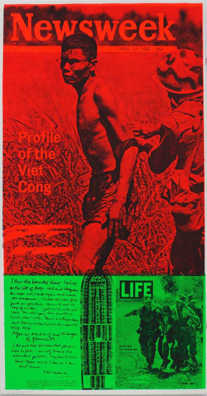
In her piece, “News of the week” the 1969 screen print, the equipment, materials and techniques she used heavily depended on the notion of mass-produced art; Pop Art. The piece forced society to view everyday visual culture as art. Kent’s’ style transcended the materials and techniques she made use of. Kent used the commercial technique of screen printing, to give her images an impersonal, reproduced feel.  There was a depersonalization of style, the hand of the artist wasn’t so obvious, artworks looked like they could have been produced commercially rather than by an artist in a studio.

Kent made her art relatable and this was paramount in communicating a refreshing and new insight to the world of mass consumerism and political unrest.

Many of Kent’s ideas aligned with those raised in the reading “The Art of Revolution: Political Posters in the Red Planet Archive – No 75 Autumn 2005”. Olga Tsara raised the idea that artists believed the purpose of art can be to heighten the local community’s sense of identity and self-esteem. Art can be produced collectively to make political statements about how artists feel. Much like Kent’s art, where it was made for the community’s sake, not for her own. [3]

Kent successfully married pop culture with contemporary issues of faith and power in a critical period of unrest and in my mind, was a powerful voice.

[1]  Osterwold, Tilman. Pop Art. [2nd] ed. Köln: Taschen, 1999. p.167.

[2] Thompson, Nato. Experimental Geography: Radical Approaches to Landscape, Cartography, and Urbanism. New York: Melville House ;, 2009.

[3] Tsara, Olga. “The Art Of Revolution Political Posters In The Redplanet Archive”. The LaTrobe Journal 75 (2005): 94. Print.

Review :WHO’S AFRAID OF COLOUR?

Emily Kam kngwarray,Anwerlarr anganenty(Big yam Dreaming)1995

Emily Kam kngwarray,Anwerlarr anganenty(Big yam Dreaming)1995

Who’s Afraid of Colour? is an exhibition presenting over 200 contemporary artworks by 118 Indigenous Australian women artists together, celebrates the diversity and daring of their work. The art work including painting, sculpture, drawing, ceramics, glass, video, photography, jewellery, textiles, design and installation. Emily Kam Kngwarray, Judy Watson and Yvonne Koolmatrie who represented Australia at the Venice Biennale in 1997 in a landmark moment which acknowledged the importance of Indigenous women’s art practice on an international scale are all featured in this exhibition. The exhibition not only show the traditional art practice but also show the contemporary art challenged by the artists.

Emily Kam Kngwarray ” was an Australian Aboriginal artist from the Utopia community in the Northern Territory. She is one of the most prominent and successful artists in the history of contemporary indigenous Australian art.” The art work of Emily Kam Kngwarray, named Anwerlarr anganenty (Big yam Dreaming) in 1995 is a typical one in the exhibition. This paint has only tangled lines which were neither notation nor narrative, but visual music with mass appeal. The yam plant was an important source of food for the Aboriginal people of the desert. So Kngwarrary cannot live without the yam in the daily life. As a part of life,Yam is especially to her as her middle name “kam” means the yellow flower of the yam that grows above the ground. Kngwarreye’s initial artistic training was as a traditional indigenous woman, preparing and using designs for women’s ceremonies.  Actually most of the woman indigenous artists are inspired like Kngwarreye. Most of their works are reflect the authentic life of the community. Their design inspired by their daily life and directly express their emotion. So the indigenous design is a very import cultural carrier need to be handed down through generation of the aboriginal community. The good design always come from real life and the value of the indigenous design need a rising. “ the use of the traditional design is essential to maintain cultural and spiritual integrity of an indigenous community and that this is sufficient reason to grant rights of control over traditional design to the community.”[1] Here culture means a traditional way of life ,communal institutions, languages, and distinct forms of cultural expression “refers to the culture of a community as a whole.”[2]

The exhibition shows not only the traditional practice of art work and the new development of it but also shows a culture of the community of the indigenous. Through this exhibition, we are not just attracted by the amazing art work, we also need to concentrate on the culture behind them. We could also feel that the attitude of the indigenous towards to the life. Most of the work without reference to sacred law or narrative: they are simply exercises in line and rhythm but is a direct reflection of their authentic life.


[1] Kimberlee Weatherall, “Culture, Autonomy and Djulibinyamurr: Individual and Community in the Construction of Rights to Traditional Designs,” The Modern Law Review, Vol. 64, No. 2, 2001, 215- 242.


[2] Ibid.

Marginalised design practitioner: Greta M. Grossman

Women_designers_Grossman

Greta M. Grossman ,Gräshoppa floor lamp,1940’s

Greta M. Grossman was a relatively unknown and almost forgotten designer until her designs were rediscovered and reproduced by Gubi. She was born in Helsingborg in 1906. Her career was at its height during the 1940’s, 50’s and 60’s as a part of California design movement.

Because of the modernity of the twentieth century pushed women’s design skills to the side-lines, women’s design is ignored by the historians and theorists of design and unrepresented in the history book. She is a female pioneer in the design history. “ We live in a world by man.”[1] Woman’s role  are shaped to be a wife, a mother and should service in the home. Woman designer’s talent  and skills be considered as natural and innate.“ Woman are considered to be naturally suited to certain areas of design production, namely , the so-called decorative art, including such works as jewelry, embroidery ,graphic illustration, weaving knitting, pottery, and dressmaking.”[2] Female’s designs are  more likely to be considered as crafts. Industrial design is dominated by male. During her apprenticeship in Helsingborg (furniture manufacturer), she was the only female in the workshop. Grossman recognised the drawbacks of being a female artist and stated that she felt she had, “to be a step ahead or else”. Therefore, Greta Grossman as a woman designer who had many remarkable achievements and encompassed industrial design, interior design and architecture is need to be remembered by history. She made a significant contribution to the modern design.

Here I choose one of her iconic design Gräshoppa floor lamp she designed in the 40’s and 50’s. The iconic Gräshoppa floor lamp was first produced in 1947. “The tubular steel tripod stand is tilted backward and the elongated aluminium conical shade is ball-jointed onto the arm; so the light can be directional, yet the glare is minimal. Both stand and shade are powder-coated.”The design show both organic and modern form. The lampshade has soft edge but the steel  tripod is geometric which perfectly reflect new modernist style. Her designs often combine wood with the materials untraditional for furniture at that time such as metal and plastic. For this specific design, it just uses the metal for product. but has a sense of elegant and peaceful, it combined simplicity with function but still with a strong personal style. Grossman’s products are unique, modern classic designs with aesthetic and functional. Her unique sense of form and delicate design language really came to life.She moved to Los Angeles in 1940 and opened the Magnussen-Grossman Studio on Rodeo Drive.At the time there were no stores selling Danish or Finnish or Swedish furniture. It was a really important bridge that she started.She was the pioneer to bring this simple functional aesthetic to the United state.

Today, Greta Grossman’s designs are still popular because they are, quite simply “good design.”


[1] Gooddall, “Design and gender.”

[2] Cheryl Buckley, ‘Made in Patriarchy: Toward a Feminist Analysis of Women and Design,’ in Design Discourse: History/Theory/Criticism, ed. Victor Margolin. Chicago and London: The University of Chicago Press, 1989, 251-62.


Street Press: FEMEN and COMBO Leading the People

SONY DSC

“No sire, it’s not a revolt; it’s a revolution.”

Bastille Day (French National Day), has been a long standing celebration in France, where it is celebrated on the 14th of July each year. This day honours the ‘Storming of the Bastille’ on the 14th of July 1789; where the people laid siege to Bastille, a prison and Royal armoury, a symbol of oppression. On that day, victory was achieved for the French Revolutionaries, giving hope of freedom and liberation throughout France. [1]

It’s fitting that COMBO, a French street artist known for his visual hijacking of iconic pictures which most are politically motivated, to paste a re-intervention of the ‘Liberty Leading the People’ painting with a provocative modern twist. Working with FEMEN, a feminist activist group, the street art photographs FEMEN members, holding a French flag and naked. This wheat pasted street art, reinterprets the famous ‘Liberty Leading the People’ painting by Eugène Delacroix, which was to commemorate the July revolution 0f 1830. This ‘hijack’ of an iconic painting was in COMBO’s words was “…to denunciate the discrimination and other misogynistic behaviour that women still suffer too often and to pay a tribute to the activists’ fight.”[1] By helping the ‘fight’ for gender equality, COMBO makes a grand statement of the revolution that does and needs to happen. By bringing it to such a public forum and on a historical day, the consumption of this wheat past was for a wider audience, bringing the gallery to them. [4]

femen leading the people 4

FEMEN, mentioned before is a radical feminist activist group originating in Ukraine, who’s goal is to fight back against the oppression on women, addressing issues on sexism, misogyny, homophobia, religious hypocrisy and sex trafficking. [1] The objectification of women body has been used in the “sexy industry, the fashion industry, advertising, always in men’s hands” [2]. In a way, COMBO and FEMEN’s interpretation, mark and set a different course of action for France, a new revolution to be start, a new fight to be won. Rather than rely on old traditional paintings where women are almost seen in naked and alluring poses, FEMEN women show a different role for women in the 21st century marching towards freedom.

Sydney's Earthworks Poster Collective

Sydney’s Earthworks Poster Collective

Sydney’s Earthworks Poster Collective, was a Sydney, Australia based organisation that produced alternative and political posters, operating from 1972-1980. It was one of the first poster collectives in Australia where an anti-commodity and anti-elitist push in the design industry. Artist would create work that would be ‘ephemeral by nature’, including installations, silkscreened posters, videos and performances.[4]  Much like Combo, poster artists were known to take other artworks ‘as a strategy to undermine the art world’s worship of originality’. COMBO’s and FEMEN’s wheat past has been a minor but unique piece of street art that has not been done before. Albeit now, graffiti has now dominated and covered the artwork, the original wheat paste still stands today. Their produced work is statement piece, appealing to the generation Ys and millennials  pop culture, maybe, believing that the purpose can instil a sense of identity and self-esteem in the new age, where art can collectively influence social action then just making a statement as individual artists. COMBOs and FEMENs contribution to the street art culture will be forever documented as social action for the community, visualising a better future of equality and freedom. [4]

Footnote –

[3] “Bastille Day”. En.wikipedia.org. N.p., 2017. Web. 6 Apr. 2017.

[2] Cochrane, Kira. “Rise Of The Naked Female Warriors”. the Guardian. N.p., 2017. Web. 6 Apr. 2017.

[1] Rojo, Jaime, and Steven Harrington. “Street Artist Hijacks An Iconic Masterpiece”. The Huffington Post. N.p., 2013. Web. 6 Apr. 2017.

[4] Tsara, Olga. “The Art Of Revolution Political Posters In The Redplanet Archive”. The LaTrobe Journal 75 (2005): 94. Print.

Current: David Hockney Embracing Technology at the NGV

The four seasons, Woldgate Woods

The Four Seasons, Woldgate Woods (Spring 2011, Summer 2010, Autumn 2010, Winter 2010), 36 digital videos synchronised and presented on 36 55-inch screens to compromise a single artwork, silent, 4 min 18 sec

David Hockney’s recent exhibition at the National Gallery of Victoria displays his most modern works of art in a fresh and new way. Current is on display from November, 2016 until March, 2017 and includes works using video montage, acrylic, photographic drawings and iPad drawings amongst others.[i] Visiting the exhibition in early March, I was able to see how he had used modern technology to his advantage and I drew parallels between this embracement of technology and certain Futurist ideologies described by Elise Takehana in her article, Legitimizing The Artist: Avant-Garde Utopianism And Relational Aesthetics.[ii]

While his work wouldn’t be considered Futuristic in nature, many of the Futurists’ ideals can be applied to his newest creations, on display in Current. Most notably, the Futurists rejected traditional forms of media and instead sought to use the best and newest technologies they could find. In Current, the majority of works were created using screen media on iPads and iPhones. To display these works in the context of how they were created, numerous phones were set up within the exhibition with the screens rotating through his work. He also experimented using motion, stitching videos together to create a sort of collage, which was a step up from his previous works using photomontage. In particular, his work ‘The four seasons, Woldgate Woods’[iii] was incredible to experience. Set up on 36 55-inch screens, each work had nine videos depicting the same drive in a different season. It was overwhelming to see how much work had gone into it and using motion gave a different dimension to experiencing his work. Even artists who specialise in film and photographic direction seldom have the patience and ingenuity to create works like this.

As Takehana outlines, “the ultimate goal of Futurism was to break from the past, creating an enlivened future and a modern Italy that did not lean on its past accomplishments.”[ii] In essence, this is what Hockney applied in his own work. Rather than revisiting old subject matter and techniques, he completely reinvented himself as a modern artist. Hockney has been careful not to box himself in and stick to a single medium or subject matter. Perhaps this is why many people consider him to be one of the greatest artists of his generation; he is constantly changing and evolving and doesn’t simply settle for what is comfortable. Few artists can work in as many mediums as he has and appear to have mastered all of them; the quality of his work does not falter across a number of areas.

Overall, the exhibition was a fantastic demonstration of Hockney’s willingness to move away from traditional media that he has previously been associated with and instead dive headfirst into the new-age.

[i] Simon Maidment et al., David Hockney: Current, 1st ed. (National Gallery of Victoria, 2016).
[ii] Elise Takehana, “Legitimizing The Artist: Avant-Garde Utopianism And Relational Aesthetics”, Queen’s Journal of Visual and Material Culture, no. 2 (2009): 1-18.
[iii] The four seasons, Woldgate Woods (Spring 2011, Summer 2010, Autumn 2010, Winter 2010), 36 digital videos synchronised and presented on 36 55-inch screens to compromise a single artwork, silent, 4 min 18 sec.